
Wednesday, 24 April 2013


Sunday, 21 April 2013
Evaluation question 7
Looking back at your preliminary task, what do you feel you have learnt in the progression from it to the full product?
From the preliminary task i feel that i have improved on my picture editing on Photoshop which aided me greatly in my final product.
Also i have learnt the importance of the placement of different factors of a magazine as from preliminary to final product it is apparent that my final product looks more professional due to everything being in the right place.
Also I have learnt that more does not mean better as with my final product i went for a more basic and cleaner look as opposed to my preliminary task where even though the same i feel as if there was an overwhelming amount of colour.
Also from preliminary task to final product i have learnt how to take a better picture thanks to a greater understanding of framing and the rule of thirds my final magazine product image looks far more natural and professional.

Also in relation to my contents pages i have learnt to include more information due to my research of magazines.
Also i learned how to use images more effectively on a contents such as to show where a main article is like i done on my final product.
Also i learned the importance of having a house style on my magazine this includes having the same clour scheme and fonts transferring from page to page.

Evaluation question 6
What have you learnt about technologies from the process of constructing this product?
During the process of constructing my product I have learnt many things about different programs.
The main program I have learnt about during this process is Adobe Photoshop cs5 Going into this task I did not know how to use Adobe Photoshop cs5 at all and now after finishing my product I now feel comfortable and confident when using it. Some of the tools I learnt about and used during the construction of my product on Adobe Photoshop cs5 are the quick select tool, polygamic tool, clone stamp, and spot heal as well as all the image adjustment options.
Another program I have learnt about during the process of constructing my product is Microsoft Publisher. Unlike Adobe Photoshop cs5 i had some knowledge of how you use Microsoft Publisher going into this project. Something I learnt however whilst constructing my product was how to use the margins option to help me organise my magazine to make it neater as well as using it to create my mock ups for my the preliminary task and final task.
Evaluation question 4/5
Who would be the audience for your media product?
As previously described in my 'target audience' post my ideal consumer would be either boy or girl aged between 16-25 with a open view on all genres of music but with a bias towards classic rock such as the Who, Beatles, Kinks e.t.c.
The target audience for my music magazine would spend the majority of their time staying out with friend and attending gigs and music festivals.
How did you attract/address your audience
First of all I attracted my target audience by having a neutral colour scheme/ house style of red, white and black. These colours are not strictly associated with either gender like other such as pink or blue and therefore both genders will feel comfortable with purchasing my product in a shop.
Also with regards to the age of my target audience I have addressed this by having a clean, neat layout of the cover page with few puffs and additional advertisements on the page. This so the magazine looks more mature and therefore more appealing to my older target audience.
As my target audience has a open view for all music I have addressed this on my contents page by having a band index like NME. This is so the consumer has a wide variety of artist to choose from to read about and not being restricted in one style of music.
As my target audience wishes to spend the majority of there spare time attending gigs and festivals i have also addressed this on my contents page by having a gig guide section so that the consumer once purchased the magazine can have all relevant information for whatever music event that they have interest in attending.
Evaluation question 3
What kind of media institution might distribute your media product and why?
I would choose to distribute my media product digitally as we are entering a decade where digital distribution is at the forefront of all distribution such as Amazon. For this reason I would go for a well established online publisher such as ICB as they would give my product the most recognition and popularity.
I would choose to distribute my media product digitally as we are entering a decade where digital distribution is at the forefront of all distribution such as Amazon. For this reason I would go for a well established online publisher such as ICB as they would give my product the most recognition and popularity.
Evaluation question 2
How does your media product represent particular social groups?
My music magazine represents my particular social group/audience in a positive way. To do this I made sure that my magazine would be bright and clean. This was done to stray away from any moody or sinister connotations that may come from having a darker magazine house style such as Kerrang.
In addition to this I also made sure that my magazine would be well structured and organised. To achieve this I tried to limit as much overlap of texts and images as possible and in turn representing my audience/ social group as mature and grown up.
In addition going back to the house style of my magazine the colour scheme I have used throughout my product is black, white and red. I chosen these colours as they are associated with newspapers and therefore reflects positively on my social group/ target audience as it shows them as smart and insightful.
Saturday, 20 April 2013
Evaluation question 1
In what ways does your media product use, develop, or challenge forms and conventions of real media products?

My music magazine follows many of the codes and conventions that you will find on other magazines on shelves today.
First convention i used was the masthead. The masthead is used to create your brands identity and what makes it stand out on shelves. As the masthead is an important feature of any magazine I did not want to over complicate it. I chose to create my Masthead in the 'red rocket' font as this is clear and easy to read whilst still looking appealing, similar to how magazines like Rolling Stones and NME also opt for a more simplistic masthead. In addition to this my masthead is also in red against a clear background to make it more clear and easier to identify when on a shelf by other magazine's.
Another convention I have followed is I layered the main image to go on top of the masthead which is most commonly seen in the Rolling Stones magazine. To do this I had to go onto adobe photoshop CS5 and use the pen tool to create a transparency


In addition a convention of music magazines that I have challenged is that cover lines are regularly placed on top of the image to keep them easily readable. In relation to my magazine due to the framing of my image my cover lines have additional space and therefore do not need to cross over the image therefore creating a more formal and organised format.
Another convention that I have followed is the use of a lure. the lure is something that entices the consumer to purchase your product. On my magazine this can be seen by the free 'Django Django' poster that is displayed in a box out to help it stand out and be more easily noticeable.
The bar code, date and price are located in a similar place to most other magazines but with a slight change to the layout.
In contrast to the rest of the magazine my main image is in black and white this can be seen used in magazines such as NME to create a feel of time and age which is why i used it for my classic rock magazine to do this I had to again go onto adobe photoshop cs5 and select the desired are with the polygamic tool and edit the colouring of the image in the adjustments section.

For my contents page I have made no drastic changes to the theme of the magazine and kept the house colours (black, white, and red) identical to the cover page. My reasoning behind this is that through my research my target audience wanted a informative magazine so to help portray this I followed the colour scheme of a newspaper to help create this connection. Also to help stick with the theme of the magazine the text of contents is in the same 'red rocket' font as the masthead to create a strong sense of brand identity.
The subheadings are used to give a sense of order with page numbers being categorised for easy navigation to the article that the readers wants to find.
Similarly to NME I have placed the page number on top of the image to show that this is in relation to one of the main articles of the magazine and makes it even easier for the reader to locate.
I have also incorporated the magazines website into the contents page.
All font is in serif font to be more formal formal and again stick with this image of being informative that my target audience desired, again similarly to NME.
Finally the page numbers are aligned to give a structured feel which can be seen in the majority of music magazines on shelves today.

With my double page spread I have incorporated a folio into the top left hand corner in a similar fashion to NME to aid navigation. Also the masthead is maintained in this to again keep brand identify.
Again i have stuck with my house colours throughout my magazine.
Also similarly to Kerrang magazine my title for the article is located in the bottom left hand side of the page and therefore gives more space for the image to be seen.
My article is done is a question and answer format with each question in a different font and colour to its answer to make it clear and easer on the reader.
Like magazines such as Rolling Stone, NME, and Kerrang i have used a drop capital indicate a clear starting position to my article.
My article has been split into two main columns when it comes to the interview to make each question and answer look shorter therefore more desirable to read for the consumer.
Mise en scene has been used on my article image to help portray what the article is about. As the article is in relation to 'Electric Feel's' new album my image has been done to show the band creating the album with the piano being used as the main prop.
Finally to create further brand identity and sticking with the house theme my picture has been edited to be black and white like the picture on my cover page which also aids the classic rock image that I am trying to create.
Final double page spread

Friday, 19 April 2013

Double Page spread draft 2

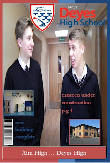
Final Front cover

Thursday, 18 April 2013

Front cover draft

This is my first draft of my front cover for my music magazine my main inspiration for this style of magazine comes from the 'Rolling Stones' magazine you can see my inspiration in this by the clear background and overall simplistic layout of the magazine with the use of only 1 image such as this

The house style of my magazine is using the colour sheme red white and black. This is because it follows the same colour scheme as a newspaper and therefore subconsiously makes a connection with the reader that the magazine is informative and educational as well as being good value for money
Contents Page Mock Up


These are my two contents page mock ups. out of the two i feel that i am going to use the firsy one as it is more structured and looks better overall.


Sunday, 14 April 2013


Tuesday, 9 April 2013
Masthead selection 2
After showing my first masthead to my target audience i was advised that it would be best to change the font. this is because my first mastehd did not look clear enough and did not fit the formal format that i was looking for. In addition I was advised to chang ethe colour of my font to red this is to best fit the connotation of a newspaper that i am aiming to achieve. This font is called 'red rocket'
Monday, 8 April 2013
masthead selection

naming my magazine
one name i was considering for the masthead of my music magazine is 'treble clef' this is because the treble clef is a universal sign of music that everyone can relate to and understand. also it fits in well with the classic rock genre as so many notes and different variations occur in classic rock. however i decided against naming my magazine this as it seems like too much of an old name and suits more classical music.
Another title i was considering for my music magazine 'E.A.D.G.B.E'. the reason for this is that those are the 6 strings on a guitar in order and therefore makes good sense for a music magazine. However i decided against using this name as not everyone would understand the name and therefore may not associate it with a music magazine.
The name i have decided upon for my music magazine is 'Decades' this is because i believe it is the name that best suits my genre of classic rock as well as being simple and easy to remember.
main image phtoshopped


front cover picture choice


Subscribe to:
Posts (Atom)